Small space, big impression – make business cards work for you
11/16/2022

Let's Start A Conversation:
No matter what specific kind of business you happen to be in, business cards should be a staple in your marketing budget. Whether you’re running a restaurant, a retail location, a professional firm, nonprofit or any other kind of business, you want your business card to effectively pass on the most crucial information to potential sales leads and new clients.
With so many cards exchanging hands today, how do you make yours stand out from the rest?
There are a number of ways to help ensure your business card makes the biggest possible impression in such a small amount of space. Here are a few of our favorites:
Cardstock choices: The weight and feel of your card in someone’s hand can ultimately be the deciding factor as to whether or not it’s placed in someone’s wallet for future reference – or if it ends up in the recycling bin. Springing for a heavier cardstock option can help your business card stand out in a pile, both by look and by touch.
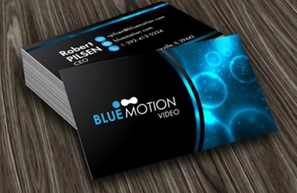
Specialty finishes: Your finishing choices can inject personality into your business card, helping to remind your clients and partners what makes you memorable. A touch of foil can add an air of sophistication to your logo, while embossing your brand can provide a whimsical feeling (and, quite literally, add some “pop”).
Glossy and matte finishes can also be used to help your card stand out from the rest of the pile. Matte finishes are going to be best for text-heavy cards but consider using a glossy finish for colourful logos or image-heavy designs.
Use both sides: Most traditional business cards have printing on just one side – which leaves a whole second side of unused real estate that can serve a wide variety of purposes. For example, if you’re already in the habit of having your name and contact information on one side of your card, use the other to feature a coupon to help entice new customers to visit.
You can also use the back side of your business card to provide a few photographs of your goods or services, or to highlight what makes your firm special or noteworthy (such as by pointing out past awards). When trying to design a business card, if you’re limiting yourself to just one side, cramming all that information into that space can be constricting; using both sides can allow every piece of information its own room to breathe.
QR codes: Sometimes the amount of information that you want to convey with your business card won’t fit in such a small space in a way that’s attractive. Avoiding a cluttered design can be done with the use of a handy QR code, which allows someone to simply use their phone to redirect them to your website or another page that goes into more detail about your business.
QR codes help to eliminate the need for manually entering a name or phone number into a new client’s contact log, which runs the risk of typos or other mistakes. This is especially useful if you or your company has anything in the name that would be considered an unusual or untraditional spelling.
An added benefit is that QR codes can be used to help track leads! You can incorporate tracking parameters within your specific QR code that helps to tell you how many times your company’s website has been visited by way of that code. This can be immensely useful when trying to plan out your future marketing strategies.
If you’re thinking about updating your business cards, contact KKP – we can help! We’ll ensure your new cards stand out, all while still staying consistent to your brand standards. Reach out to the KKP team today to get started.


